

Accepting Select Clients
Work
About
Resume
Contact
Case Study
Insurance Ownership Change: Eliminating a $1.7M Annual Problem
How MassMutual’s digital experience reduced call center traffic and eliminated over 10,000 NIGO errors.

Timofey Piper,
Between Hands,
2024,
Vector illustration
Artwork Details
MassMutual
Senior Product Designer
3 month
MassMutual was experiencing high customer dissatisfaction and rising operational costs due to its reliance on outdated, paper-based forms. As the sole Senior Product Designer on a specialized six-person team, I redesigned the critical 'policy ownership change' workflow into a digital solution within a 3-month timeframe.
Challenge


1

$10.7 Million
Avoidable revenue loss driven by legacy design


21,000 Customers
Avoidable customer loss driven by legacy design
F-

-75 NPS
Mobile net promoter score for legacy design


65-Point Deficit
Satisfaction shortfall driven by legacy design
Solution
Digital Workflow for Ownership Change
Essentials


Coming Soon
Complete Walkthrough
All Screens & Workflow
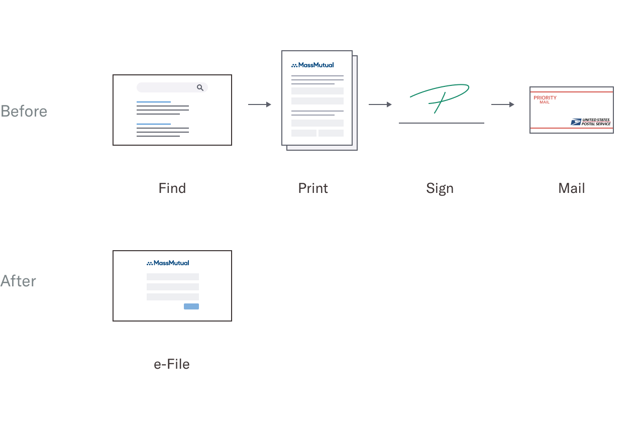
Before
After
John


Redundant Questions
Cecilia

John
New Owner

ContingentOwner
Order of Inheritance
A
B


A
B
D
C
Relevant Questions
1

2
3


1
2

1
Bundling Questions
?

?

Legal Jargon
Impact
$1.1M
Annual data entry and support savings
123k
1.3M
Legacy
Digital
1.25 hour
Average customer time savings per request
27 m
103m
Legacy
Digital
Complete Case Study
Context
Understanding an outdated process
Situation
MassMutual, the third-largest life insurer in the U.S., relied on paper-based forms for policy changes. Customers had to locate the correct form online, print it, sign it, and mail it back to the company. Employees then reviewed the forms for errors and manually entered the data into the system. This outdated system led to growing customer frustration and rising operational costs.
My role
To modernize this inefficient process, I was hired as the sole designer on a specialized six-person team tasked with developing a digital solution to eliminate the need for paper forms. My work focused on a series of high-impact requests, including the Policy Ownership Change.

Challenge
An opportunity to increasing customer satisfaction while reducing operational cost
The Policy Ownership Change request allows policyholders to transfer their policy rights to another person or entity. This process often arises during major life events, such as marriage, divorce, inheritance, or business succession.
I initially assumed the request form would be similar to others I had worked on. However, I soon realized it was the most challenging request form due to the numerous scenarios involving complex family structures, varying estate sizes and tax implications. If completed incorrectly, the form could lead to significant tax penalties for customers, sometimes reaching thousands of dollars.
Legacy design
By combining ownership change and beneficiary change requests into one form, the original design left customers confused about which questions applied to them. The form’s unconventional structure required users to jump between sections, and its lack of guidance resulted in frequent customer support calls. In total, 20,000 hours per year were spent on support and correcting errors.
Legacy Form


Customer interviews
Feedback from 6 participants, along with internal data, revealed common complaints such as the inconvenience of mailing forms, unclear instructions, complicated financial terms, and the lengthy time required to complete the form. Customers reported spending an average of 1.2 hours to complete and mail the form.
Employee interviews
MassMutual’s data entry and customer support teams estimated that the Ownership Change Request form was costing $30,000 annually in customer support calls, $40,000 in corrections, and $160,000 in manual data entry for mailed-in forms.
User flow
While most user flows were straightforward, complex situations, such as those involving large families and intricate estates, had the potential to fall into legal limbo. Collaborating with the Business Analyst, we identified and addressed every possible legal gray area scenario. The user flow was the most challenging part of the entire project and took almost three months to complete.
User Journey


Hypothesis
With over a decade of experience as a UX designer, I was confident that applying proven UX techniques, honed through years of working with digital forms, would deliver outcomes far beyond the capabilities of paper forms. Instead my main priority was to ensure that confusing or complex questions were clarified and that any potential legal gray areas were accounted for in the user flow.
Product strategy
My top priority is to hand off design work to developers as quickly as possible. To achieve this, I focus on features with the highest impact, lowest effort, and proven solutions. These quick wins showcase the value of design to stakeholders. In the second phase, having gained a productivity lead over development, I can focus on more complex features that require additional time and effort. In the third phase, while the first two phases are in development, I conduct user testing, refine visual design, and work on features that are simple to implement but may take longer to align with business needs, such as text refinement or copywriting.
Success criteria
Upon completing my research, I defined key measurable objectives that I planned to achieve through my design work. Securing sign-off from stakeholders, business analysts, UX researchers, and other project team members was essential to ensure alignment on our goals.
Increase customer satisfaction by

Eliminate print, sign, and send.
Reducing time it takes customers complete the form.
Simplifying complex legal and financial questions.
Simplifying to show only relative questions.
Reduce business cost by
Illuminate manual data entry.
Reducing customer support call volume.
Reducing data correction.

Solution
High impact, low effort, proven solutions
With more than a decade of experience designing UX forms, I applied five proven solutions to achieve the highest impact. I prioritized the process by addressing low-effort, high-effort, and finally the “long-effort” solutions.
Removing redundant questions
The legacy form was a marathon, taking customers an average of 103 minutes to complete. A major bottleneck was the requirement to manually re-enter basic data (name, address, phone) that the company already possessed. This redundancy felt disrespectful of the user's time; only 2 of 6 participants preferred the manual process of entering this information themselves.
We leveraged existing customer profiles to pre-fill these basic fields, allowing users to simply review the data rather than typing it from scratch. This automation removed the "grunt work" from the application. The efficiency won them over: 5 of 6 participants preferred the pre-filled approach over manual entry.
John
Before
After
Untangling the order of inheritance
The legacy form obscured the "continuation of ownership" (the sequence of inheritance after death). With over 27 potential variations, the paper format was impossible to follow; 3 of 6 participants could track the inheritance order involving multiple family members, though 4 of 6 understood the isolated role definitions.
We paired every Role explicitly with the assigned Name (e.g., "Beneficiary: John Doe"). This association appeared dynamically whenever a new person was added and again on the final review page. This context was vital: 6 of 6 participants preferred seeing the Name and Role side-by-side.
New Owner
ContingentOwner
Cecilia
John
Before
After
Asking only relevant questions
Since the legacy form was paper-based, customers encountered a list of irrelevant questions, making it unclear which ones they needed to complete. I believed that a digital solution showing only the questions specific to their situation would greatly reduce this confusion. Research indicated that only 2 of 6 participants were entirely confident about which questions to answer.
As customers answered, only the relevant follow-up questions pertaining to their situation were shown. They wouldn’t see or know about other questions that didn’t apply to them. This clarity was decisive: 5 of 6 participants preferred the new approach of seeing only the questions relevant to them.
A
B
D
C
A
B
Before
After
Bundling questions for better balance
With the legacy form being paper-based, all questions were presented at once. In my experience, showing all the questions at once can feel overwhelming and stressful for the customer. I user tested three ways of presenting questions: all at once, one at a time, and grouped together. Additionally, I tested a solution with and without a progress bar. The legacy "all at once" format caused significant anxiety; only 1 of 6 participants understood the scope of questions presented this way.
User testing revealed that the best approach was to bundle similar questions into manageable groups. To achieve this, some questions needed to be rearranged from their original sections to improve the overall flow. The progress bar was eliminated because the number of questions varied across user flows. This structure provided the necessary clarity: 4 of 6 participants understood the presentation and preferred the "grouped" questions.
1
2
3

1
2
1
Before
After
Negotiations to simplify the legal jargon
The legacy form was riddled with opaque financial terminology, often alienating customers. While typically defended as a "legal necessity," this jargon acted as a barrier to entry rather than a safeguard. Terms like "right of survivorship" and "tenants in common" were major stumbling blocks; only 1 of 6 participants could define these concepts during initial research.
I partnered with Business Analysts to translate this complexity into plain English, adding contextual tooltips where specific legal phrasing was mandatory. While the code changes were simple, securing approval required significant negotiation to balance strict compliance with user empathy. This "plain language" strategy paid off: 4 of 6 participants understood every question asked.
?
Before
After
Impact
Reduced costs, saved time, satisfied customers
Operational cost savings
The digital platform significantly reduces operating costs
Cost of labor for data entry and support, per year
Data Entry
Support Calls
Error Resolution
Legacy Form
Digital Solution

0
400K
800K
1.2M
1.6M
Source: MassMutual Internal Operational Data (2020)
TP
Customer time savings
Customers complete the ownership request much faster
Average time required to complete a single form, in minutes
Locate Form
Contact Info
Request Details
Data Review
Print & Mail
Legacy Form
Digital Solution
0
20
40
60
80
100
Source: MassMutual User Experience Research (UXR) Study (2020)
TP
User testing
Participants clearly prefer the digital workflow
Comparison of participant feedback, based on a before-and-after study of 6 users
Legacy Platform
Redesigned Platform
Completed tasks without confusion
2
5
Understood the order of inheritance
3
6
Understood which questions required answers
2
5
Preferred the tested question format
1
4
Understood all legal terminology
1
4
Source: MassMutual User Experience Research (UXR) Study (2020)
TP
Critical data error rate
While hard to quantify, the value of error prevention is massive. By adding validation that paper forms simply can’t offer, we stop mistakes before they happen. This safeguards our customers against future tax bills and legal headaches, potentially saving them millions in avoided costs.
Case StudyWritten and Designed by Timofey Piper


© 2026 Studio-TP LLC. All rights reserved.


Product & Visual Designer Specializing in Financial Technology
Case Study
Insurance Ownership Change: Eliminating a $1.7M Annual Problem
How MassMutual’s digital experience reduced call center traffic and eliminated over 10,000 NIGO errors.
Timofey Piper,
Between Hands,
2024,
Vector illustration
Artwork Details
MassMutual
Senior Product Designer
3 month
MassMutual was experiencing high customer dissatisfaction and rising operational costs due to its reliance on outdated, paper-based forms. As the sole Senior Product Designer on a specialized six-person team, I redesigned the critical 'policy ownership change' workflow into a digital solution within a 3-month timeframe.
Challenge
1
$10.7 Million
Avoidable revenue loss driven by legacy design
21,000 Customers
Avoidable customer loss driven by legacy design
F-
-75 NPS
Mobile net promoter score for legacy design
65-Point Deficit
Satisfaction shortfall driven by legacy design
Solution
Digital Workflow for Ownership Change
Essentials
Coming Soon
Complete Walkthrough
All Screens & Workflow
Before
After
Redundant Questions
John
Order of Inheritance
Cecilia
John
New Owner
ContingentOwner
Relevant Questions
A
B
A
B
D
C
Bundling Questions
1
2
3
1
2
1
Legal Jargon
?
?
Impact
$1.1M
Annual data entry and support savings
123k
1.3M
Legacy
Digital
1.25 hour
Average customer time savings per request
27 m
103m
Legacy
Digital

Complete Case Study
Context
Understanding an outdated process
Situation
MassMutual, the third-largest life insurer in the U.S., relied on paper-based forms for policy changes. Customers had to locate the correct form online, print it, sign it, and mail it back to the company. Employees then reviewed the forms for errors and manually entered the data into the system. This outdated system led to growing customer frustration and rising operational costs.
My role
To modernize this inefficient process, I was hired as the sole designer on a specialized six-person team tasked with developing a digital solution to eliminate the need for paper forms. My work focused on a series of high-impact requests, including the Policy Ownership Change.
Challenge
An opportunity to increasing customer satisfaction while reducing operational cost
The Policy Ownership Change request allows policyholders to transfer their policy rights to another person or entity. This process often arises during major life events, such as marriage, divorce, inheritance, or business succession.
I initially assumed the request form would be similar to others I had worked on. However, I soon realized it was the most challenging request form due to the numerous scenarios involving complex family structures, varying estate sizes and tax implications. If completed incorrectly, the form could lead to significant tax penalties for customers, sometimes reaching thousands of dollars.
Legacy design
By combining ownership change and beneficiary change requests into one form, the original design left customers confused about which questions applied to them. The form’s unconventional structure required users to jump between sections, and its lack of guidance resulted in frequent customer support calls. In total, 20,000 hours per year were spent on support and correcting errors.
Legacy Form
Customer interviews
Feedback from 6 participants, along with internal data, revealed common complaints such as the inconvenience of mailing forms, unclear instructions, complicated financial terms, and the lengthy time required to complete the form. Customers reported spending an average of 1.2 hours to complete and mail the form.
Employee interviews
MassMutual’s data entry and customer support teams estimated that the Ownership Change Request form was costing $30,000 annually in customer support calls, $40,000 in corrections, and $160,000 in manual data entry for mailed-in forms.
User flow
While most user flows were straightforward, complex situations, such as those involving large families and intricate estates, had the potential to fall into legal limbo. Collaborating with the Business Analyst, we identified and addressed every possible legal gray area scenario. The user flow was the most challenging part of the entire project and took almost three months to complete.
User Journey
Hypothesis
With over a decade of experience as a UX designer, I was confident that applying proven UX techniques, honed through years of working with digital forms, would deliver outcomes far beyond the capabilities of paper forms. Instead my main priority was to ensure that confusing or complex questions were clarified and that any potential legal gray areas were accounted for in the user flow.
Product strategy
My top priority is to hand off design work to developers as quickly as possible. To achieve this, I focus on features with the highest impact, lowest effort, and proven solutions. These quick wins showcase the value of design to stakeholders. In the second phase, having gained a productivity lead over development, I can focus on more complex features that require additional time and effort. In the third phase, while the first two phases are in development, I conduct user testing, refine visual design, and work on features that are simple to implement but may take longer to align with business needs, such as text refinement or copywriting.
Success criteria
Upon completing my research, I defined key measurable objectives that I planned to achieve through my design work. Securing sign-off from stakeholders, business analysts, UX researchers, and other project team members was essential to ensure alignment on our goals.
Increase customer satisfaction by
Eliminate print, sign, and send.
Reducing time it takes customers complete the form.
Simplifying complex legal and financial questions.
Simplifying to show only relative questions.
Reduce business cost by
Illuminate manual data entry.
Reducing customer support call volume.
Reducing data correction.
Solution
High impact, low effort, proven solutions
With more than a decade of experience designing UX forms, I applied five proven solutions to achieve the highest impact. I prioritized the process by addressing low-effort, high-effort, and finally the “long-effort” solutions.
Removing redundant questions
The legacy form was a marathon, taking customers an average of 103 minutes to complete. A major bottleneck was the requirement to manually re-enter basic data (name, address, phone) that the company already possessed. This redundancy felt disrespectful of the user's time; only 2 of 6 participants preferred the manual process of entering this information themselves.
We leveraged existing customer profiles to pre-fill these basic fields, allowing users to simply review the data rather than typing it from scratch. This automation removed the "grunt work" from the application. The efficiency won them over: 5 of 6 participants preferred the pre-filled approach over manual entry.
John
Before
After
Untangling the order of inheritance
The legacy form obscured the "continuation of ownership" (the sequence of inheritance after death). With over 27 potential variations, the paper format was impossible to follow; 3 of 6 participants could track the inheritance order involving multiple family members, though 4 of 6 understood the isolated role definitions.
We paired every Role explicitly with the assigned Name (e.g., "Beneficiary: John Doe"). This association appeared dynamically whenever a new person was added and again on the final review page. This context was vital: 6 of 6 participants preferred seeing the Name and Role side-by-side.
New Owner
ContingentOwner
Cecilia
John
Before
After
Asking only relevant questions
Since the legacy form was paper-based, customers encountered a list of irrelevant questions, making it unclear which ones they needed to complete. I believed that a digital solution showing only the questions specific to their situation would greatly reduce this confusion. Research indicated that only 2 of 6 participants were entirely confident about which questions to answer.
As customers answered, only the relevant follow-up questions pertaining to their situation were shown. They wouldn’t see or know about other questions that didn’t apply to them. This clarity was decisive: 5 of 6 participants preferred the new approach of seeing only the questions relevant to them.
A
B
D
C
A
B
Before
After
Bundling questions for better balance
With the legacy form being paper-based, all questions were presented at once. In my experience, showing all the questions at once can feel overwhelming and stressful for the customer. I user tested three ways of presenting questions: all at once, one at a time, and grouped together. Additionally, I tested a solution with and without a progress bar. The legacy "all at once" format caused significant anxiety; only 1 of 6 participants understood the scope of questions presented this way.
User testing revealed that the best approach was to bundle similar questions into manageable groups. To achieve this, some questions needed to be rearranged from their original sections to improve the overall flow. The progress bar was eliminated because the number of questions varied across user flows. This structure provided the necessary clarity: 4 of 6 participants understood the presentation and preferred the "grouped" questions.
1
2
3
1
2
1
Before
After
Negotiations to simplify the legal jargon
The legacy form was riddled with opaque financial terminology, often alienating customers. While typically defended as a "legal necessity," this jargon acted as a barrier to entry rather than a safeguard. Terms like "right of survivorship" and "tenants in common" were major stumbling blocks; only 1 of 6 participants could define these concepts during initial research.
I partnered with Business Analysts to translate this complexity into plain English, adding contextual tooltips where specific legal phrasing was mandatory. While the code changes were simple, securing approval required significant negotiation to balance strict compliance with user empathy. This "plain language" strategy paid off: 4 of 6 participants understood every question asked.
?
Before
After
Impact
Reduced costs, saved time, satisfied customers
Operational cost savings
The digital platform significantly reduces operating costs
Cost of labor for data entry and support, per year
Data Entry
Support Calls
Error Resolution
Legacy Form
Digital Solution
0
400K
800K
1.2M
1.6M
Source: MassMutual Internal Operational Data (2020)
TP
Customer time savings
Customers complete the ownership request much faster
Average time required to complete a single form, in minutes
Locate Form
Contact Info
Request Details
Data Review
Print & Mail
Legacy Form
Digital Solution
0
20
40
60
80
100
Source: MassMutual User Experience Research (UXR) Study (2020)
TP
User testing
Participants clearly prefer the digital workflow
Comparison of participant feedback, based on a before-and-after study of 6 users
Legacy Platform
Redesigned Platform
Completed tasks without confusion
2
5
Understood the order of inheritance
3
6
Understood which questions required answers
2
5
Preferred the tested question format
1
4
Understood all legal terminology
1
4
Source: MassMutual User Experience Research (UXR) Study (2020)
TP
Critical data error rate
While hard to quantify, the value of error prevention is massive. By adding validation that paper forms simply can’t offer, we stop mistakes before they happen. This safeguards our customers against future tax bills and legal headaches, potentially saving them millions in avoided costs.
Case StudyWritten and Designed by Timofey Piper
© 2026 Studio-TP LLC. All rights reserved.
Product & Visual Designer Specializing in Financial Technology
Case Study
Insurance Ownership Change: Eliminating a $1.7M Annual Problem
How MassMutual’s digital experience reduced call center traffic and eliminated over 10,000 NIGO errors.
Timofey Piper,
Between Hands,
2024,
Vector illustration
Artwork Details
MassMutual
Senior Product Designer
3 month
MassMutual was experiencing high customer dissatisfaction and rising operational costs due to its reliance on outdated, paper-based forms. As the sole Senior Product Designer on a specialized six-person team, I redesigned the critical 'policy ownership change' workflow into a digital solution within a 3-month timeframe.
Challenge
1
$10.7 Million
Avoidable revenue loss driven by legacy design
21,000 Customers
Avoidable customer loss driven by legacy design
F-
-75 NPS
Mobile net promoter score for legacy design
65-Point Deficit
Satisfaction shortfall driven by legacy design
Solution
Digital Workflow for Ownership Change
Essentials
Coming Soon
Complete Walkthrough
All Screens & Workflow
Before
After
Redundant Questions
John
Order of Inheritance
Cecilia
John
New Owner
ContingentOwner
Relevant Questions
A
B
A
B
D
C
Bundling Questions
1
2
3
1
2
1
Legal Jargon
?
?
Impact
$1.1M
Annual data entry and support savings
123k
1.3M
Legacy
Digital
1.25 hour
Average customer time savings per request
27 m
103m
Legacy
Digital

Complete Case Study
Context
Understanding an outdated process
Situation
MassMutual, the third-largest life insurer in the U.S., relied on paper-based forms for policy changes. Customers had to locate the correct form online, print it, sign it, and mail it back to the company. Employees then reviewed the forms for errors and manually entered the data into the system. This outdated system led to growing customer frustration and rising operational costs.
My role
To modernize this inefficient process, I was hired as the sole designer on a specialized six-person team tasked with developing a digital solution to eliminate the need for paper forms. My work focused on a series of high-impact requests, including the Policy Ownership Change.
Challenge
An opportunity to increasing customer satisfaction while reducing operational cost
The Policy Ownership Change request allows policyholders to transfer their policy rights to another person or entity. This process often arises during major life events, such as marriage, divorce, inheritance, or business succession.
I initially assumed the request form would be similar to others I had worked on. However, I soon realized it was the most challenging request form due to the numerous scenarios involving complex family structures, varying estate sizes and tax implications. If completed incorrectly, the form could lead to significant tax penalties for customers, sometimes reaching thousands of dollars.
Legacy design
By combining ownership change and beneficiary change requests into one form, the original design left customers confused about which questions applied to them. The form’s unconventional structure required users to jump between sections, and its lack of guidance resulted in frequent customer support calls. In total, 20,000 hours per year were spent on support and correcting errors.
Customer interviews
Feedback from 6 participants, along with internal data, revealed common complaints such as the inconvenience of mailing forms, unclear instructions, complicated financial terms, and the lengthy time required to complete the form. Customers reported spending an average of 1.2 hours to complete and mail the form.
Employee interviews
MassMutual’s data entry and customer support teams estimated that the Ownership Change Request form was costing $30,000 annually in customer support calls, $40,000 in corrections, and $160,000 in manual data entry for mailed-in forms.
User flow
While most user flows were straightforward, complex situations, such as those involving large families and intricate estates, had the potential to fall into legal limbo. Collaborating with the Business Analyst, we identified and addressed every possible legal gray area scenario. The user flow was the most challenging part of the entire project and took almost three months to complete.
Hypothesis
With over a decade of experience as a UX designer, I was confident that applying proven UX techniques, honed through years of working with digital forms, would deliver outcomes far beyond the capabilities of paper forms. Instead my main priority was to ensure that confusing or complex questions were clarified and that any potential legal gray areas were accounted for in the user flow.
Product strategy
My top priority is to hand off design work to developers as quickly as possible. To achieve this, I focus on features with the highest impact, lowest effort, and proven solutions. These quick wins showcase the value of design to stakeholders. In the second phase, having gained a productivity lead over development, I can focus on more complex features that require additional time and effort. In the third phase, while the first two phases are in development, I conduct user testing, refine visual design, and work on features that are simple to implement but may take longer to align with business needs, such as text refinement or copywriting.
Success criteria
Upon completing my research, I defined key measurable objectives that I planned to achieve through my design work. Securing sign-off from stakeholders, business analysts, UX researchers, and other project team members was essential to ensure alignment on our goals.
Increase customer satisfaction by
Eliminate print, sign, and send.
Reducing time it takes customers complete the form.
Simplifying complex legal and financial questions.
Simplifying to show only relative questions.
Reduce business cost by
Illuminate manual data entry.
Reducing customer support call volume.
Reducing data correction.
Solution
High impact, low effort, proven solutions
With more than a decade of experience designing UX forms, I applied five proven solutions to achieve the highest impact. I prioritized the process by addressing low-effort, high-effort, and finally the “long-effort” solutions.
Removing redundant questions
The legacy form was a marathon, taking customers an average of 103 minutes to complete. A major bottleneck was the requirement to manually re-enter basic data (name, address, phone) that the company already possessed. This redundancy felt disrespectful of the user's time; only 2 of 6 participants preferred the manual process of entering this information themselves.
We leveraged existing customer profiles to pre-fill these basic fields, allowing users to simply review the data rather than typing it from scratch. This automation removed the "grunt work" from the application. The efficiency won them over: 5 of 6 participants preferred the pre-filled approach over manual entry.
John
Before
After
Untangling the order of inheritance
The legacy form obscured the "continuation of ownership" (the sequence of inheritance after death). With over 27 potential variations, the paper format was impossible to follow; 3 of 6 participants could track the inheritance order involving multiple family members, though 4 of 6 understood the isolated role definitions.
We paired every Role explicitly with the assigned Name (e.g., "Beneficiary: John Doe"). This association appeared dynamically whenever a new person was added and again on the final review page. This context was vital: 6 of 6 participants preferred seeing the Name and Role side-by-side.
New Owner
ContingentOwner
Cecilia
John
Before
After
Asking only relevant questions
Since the legacy form was paper-based, customers encountered a list of irrelevant questions, making it unclear which ones they needed to complete. I believed that a digital solution showing only the questions specific to their situation would greatly reduce this confusion. Research indicated that only 2 of 6 participants were entirely confident about which questions to answer.
As customers answered, only the relevant follow-up questions pertaining to their situation were shown. They wouldn’t see or know about other questions that didn’t apply to them. This clarity was decisive: 5 of 6 participants preferred the new approach of seeing only the questions relevant to them.
A
B
D
C
A
B
Before
After
Bundling questions for better balance
With the legacy form being paper-based, all questions were presented at once. In my experience, showing all the questions at once can feel overwhelming and stressful for the customer. I user tested three ways of presenting questions: all at once, one at a time, and grouped together. Additionally, I tested a solution with and without a progress bar. The legacy "all at once" format caused significant anxiety; only 1 of 6 participants understood the scope of questions presented this way.
User testing revealed that the best approach was to bundle similar questions into manageable groups. To achieve this, some questions needed to be rearranged from their original sections to improve the overall flow. The progress bar was eliminated because the number of questions varied across user flows. This structure provided the necessary clarity: 4 of 6 participants understood the presentation and preferred the "grouped" questions.
1
2
3
1
2
1
Before
After
Negotiations to simplify the legal jargon
The legacy form was riddled with opaque financial terminology, often alienating customers. While typically defended as a "legal necessity," this jargon acted as a barrier to entry rather than a safeguard. Terms like "right of survivorship" and "tenants in common" were major stumbling blocks; only 1 of 6 participants could define these concepts during initial research.
I partnered with Business Analysts to translate this complexity into plain English, adding contextual tooltips where specific legal phrasing was mandatory. While the code changes were simple, securing approval required significant negotiation to balance strict compliance with user empathy. This "plain language" strategy paid off: 4 of 6 participants understood every question asked.
?
Before
After
Impact
Reduced costs, saved time, satisfied customers
Operational cost savings
The digital platform significantly reduces operating costs
Cost of labor for data entry and support, per year
Data Entry
Support Calls
Error Resolution
Legacy Form
Digital Solution
0
400K
800K
1.2M
1.6M
Source: MassMutual Internal Operational Data (2020)
TP
Customer time savings
Customers complete the ownership request much faster
Average time required to complete a single form, in minutes
Locate Form
Contact Info
Request Details
Data Review
Print & Mail
Legacy Form
Digital Solution
0
20
40
60
80
100
Source: MassMutual User Experience Research (UXR) Study (2020)
TP
User testing
Participants clearly prefer the digital workflow
Comparison of participant feedback, based on a before-and-after study of 6 users
Legacy Platform
Redesigned Platform
Completed tasks without confusion
2
5
Understood the order of inheritance
3
6
Understood which questions required answers
2
5
Preferred the tested question format
1
4
Understood all legal terminology
1
4
Source: MassMutual User Experience Research (UXR) Study (2020)
TP
Critical data error rate
While hard to quantify, the value of error prevention is massive. By adding validation that paper forms simply can’t offer, we stop mistakes before they happen. This safeguards our customers against future tax bills and legal headaches, potentially saving them millions in avoided costs.
Case StudyWritten and Designed by Timofey Piper
© 2026 Studio-TP LLC. All rights reserved.