

Accepting Select Clients
Work
About
Resume
Contact
Case Study
Retail Banking:Fixing a $7.8M UX Penalty
How a new design system overhauled a legacy platform, eliminating 15% of UX-driven attrition and driving NPS to +80.

Timofey Piper,
Provincetown Ferry,
2022,
Vector illustration
Artwork Details
Eastern Bank
Product Design Lead
1 year
Eastern Bank began a digital-first pivot to stay competitive. However, instead of retention, the legacy user experience became the primary driver of customer loss. As Product Design Lead, I recruited and led a six-person team to redesign and launch new desktop and mobile platforms for Consumer and Small Business banking within a 1-year timeframe.
Challenge


1

$7.8 Million
Annual revenue loss


21,000 Customers
Annual customer loss
F-

-75 NPS
Mobile user satisfaction


65-Point Below
J.D. Power satisfaction
Solution
Desktop & Mobile Platform for Consumer & Business Banking
Essentials


Coming Soon
Complete Walkthrough
All Screens & Workflow
Impact
$60M
Annual net income gain in annual profits
2015

Launch
2019


+96
Customer satisfaction point gain on J.D. Power index
2013
2019


Launch

+80 NPS
Net promoter score mobile score in Bentley University audit
Mobile
Desktop
Complete Case Study
Context
The shortcomings of an 'off-the-shelf' solution
Situation
Eastern Bank, the largest regional bank in Massachusetts, was pivoting to a digital-first future. However, the 'off-the-shelf' platform they adopted was visually outdated and glitchy. The result was a financial bleed where an estimated 1,200 customers left every month due to the poor user experience design, putting millions of dollars in future revenue at risk. This instability also paralyzed our ability to scale; with only 20% of our 700,000 customers active online, the broken platform made it impossible to migrate the "Offline Majority" away from expensive branch transactions.
My role
To address this issue, I was hired as the Product Design Lead to establish and lead a six-person design team. My team’s goal was to redesign and launch a new user experience for desktop and mobile banking for the consumer and small business segments, sitting on top of the existing bank backend.

Challenge
Unifying a broken legacy platform
The core problem was not the platform's technical capabilities, but its usability. Users were unaware that key features existed, got lost in confusing steps, and distrusted the outdated visual design.
Within my first week, I initiated a hiring strategy aligned with our roadmap, staffing designers to own specific features. To orchestrate these parallel efforts, I established a shared design system to unify the current platform and scale to future products. I enforced this alignment through weekly design critiques and daily standups.
Legacy design
My audit revealed a platform that looked a decade behind, stitched together with disjointed third-party applications. The cluttered layout forced users to hunt for basic features, while significant accessibility gaps exposed the bank to legal liability. This inconsistency is dangerous—it makes customers wonder, "If the platform is neglected, will it make mistakes with my money?"
Legacy Platform


Competition
Eastern Bank faced pressure from two sides: giants like Bank of America with massive scale, and agile FinTech startups with zero overhead. With physical branches becoming a financial liability, the bank had to pivot to a digital-first strategy. To rebuild our system, we hand-picked the strongest features from both competitors to create a modern hybrid platform.
Customer interviews
To validate our internal metrics, we partnered with Bentley University for an external audit. The results were alarming with a Net Promoter Score (NPS) of -27 for Desktop and -75 for Mobile. This independent data confirmed the platform’s design was a critical business failure.
Employee interviews
Customer Support reported that 30% of help desk calls were driven purely by UI confusion. Additionally, Branch Operations noted that 40% of in-person visits were for routine transactions that customers could have easily completed online.
Hypotheses & strategy
I believed that the individual features were not broken but simply disjointed. My hypothesis was that the solution was not to rebuild the tools but to build a design system around them. To secure stakeholder buy-in, I prioritized rapid validation, bringing customers in immediately to test features. This early success built trust with leadership, authorizing us to scale the project from Consumer web to Mobile and Small Business.
User Journey


Success criteria
Increase customer satisfaction by

Stemming the monthly loss of 1,200 customers caused by the legacy platform.
Restoring user trust by increasing NPS scores.
Reduce business cost by
Reducing support calls resulting from the legacy platform.
Increasing digital-first adoption to decrease branch operational costs.
Implementing a design system to ship new features faster.

Solution
A design system to restore order
Since the backend was immutable, we focused on maximizing frontend control. The Design System became the central component of the strategy, yielding the highest immediate ROI.
Design system to restoring trust & consistency
The legacy platform was visually outdated, which eroded trust. Customers equated poor aesthetics with poor security. Only 3 of 16 participants felt the interface looked "stable." A crucial flaw was the inconsistency of input forms; behaviors ranged wildly from long scrolling pages to sudden pop-ups. In testing, 7 of 16 participants became confused or got lost completely.
To restore confidence, we implemented a global Design System—simple in concept, but complex to execute at that time. This holistic overhaul drove a 400% increase in confidence, with 12 of 16 participants rating the design "trustworthy" despite the backend remaining unchanged. We standardized inconsistent inputs into a foundational "stepper" framework (Intro > Input > Review > Confirm). This adaptable structure eliminated friction, allowing 14 of 16 participants to complete tasks without confusion.
Aa
A
a


Before
After
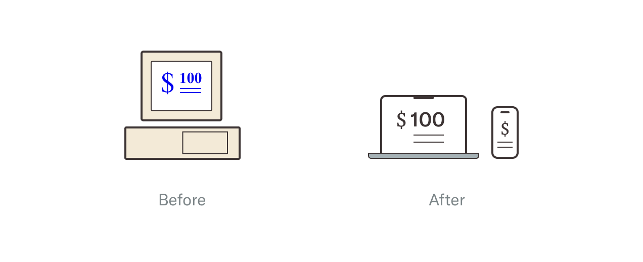
Taming the 3rd-party "Frankenstein"
The platform was a "Frankenstein" of disjointed third-party tools, creating a digital "Broken Windows" effect. A "Confirm" button might be green on the left in one tool, but blue on the right in another. These inconsistencies pierced the bank’s "privacy bubble," triggering fears of phishing scams. Only 5 of 16 participants felt confident that their data was secure.
Our solution was a strategic "balancing act." For flexible tools, we executed full redesigns; for locked backends, we engineered a visual wrapper using CSS overrides to force alignment; and for low-traffic utilities, we intentionally left them alone to conserve resources. This strategy masked the complex vendor network. Post-launch, 13 of 16 participants reported they felt they never left the secure banking environment.
A
A
B
Before
After
Rearranging essentials to the front
The legacy navigation buried essential tools under layers of confusing menus. Finding the 'freeze debit card' function—a critical security feature—took users an average of 3 minutes and 40 seconds. This frustration directly contributed to increased call center volume; only 2 of 16 participants rated the existing navigation as intuitive.
We reorganized the Information Architecture to prioritize high-value features. We elevated common actions like Transfers and Bill Pay into a primary "Quick Actions" bar and moved Debit Card Management to the main navigation. This reduced time-on-task by 90%; participants could now find the freeze function in an average of 20 seconds. 16 of 16 participants preferred the new layout.
B
A
C
A
C


Before
After
Accessibility & banking regulation
The legacy platform exposed the bank to legal liability. A Bentley University audit revealed critical WCAG failures: tiny text, low contrast, and features buried in 'hover states' inaccessible on touchscreens. This lack of clarity meant only 7 of 16 participants understood the legal terminology.
We integrated accessibility into the Design System's core, avoiding post-launch patches. We engineered touch-friendly components and scalable text for all devices. Crucially, we replaced dense legalese with plain English and tooltips. Verification confirmed 100% WCAG compliance, and 15 of 16 participants reported full understanding of the terminology.
Before
After
Aa
Aa
Team alignment & consistency
I operationalized alignment by adapting the studio critique model from my background at RISD. Beyond standard Daily Standups, I facilitated Team Critiques to expose blind spots that even Senior Designers miss in their own work. This process provided total visibility and allowed the team to see exactly what everyone else was building in real-time. It proved to be a high-ROI process. For a minimal time investment, we eliminated redundant work and ensured that the platform felt cohesive rather than a collection of siloed features.
Before
After


Impact
Retained users, drove revenue, restored trust
The strategic pivot to a unified digital system immediately stabilized the user base and reversed years of negative customer momentum. By addressing usability failures and restoring trust, the platform transformed from a financial liability into a critical growth engine for the bank.
Annual net income
Digital efficiency has doubled the bank’s annual profit
Annual net income, in millions of dollars

2011
2012
2013
2014
2015
2016
2017
2018
2019
140

120
100
80
60
40


Platform Launch Jan 2017
$62.7
$122.7
Source: Eastern Bank Corporation Annual Financial Results (Massachusetts 2011–2019)
TP
Customer satisfaction
J.D. Power confirms the rise in satisfaction
Regional satisfaction index score, on a scale of 0–1000
Eastern Bank
Regional Winner
2011
2012
2013
2014
2015
2016
2017
2018
2019
880
860
840
820
800
780
760


777
873


Platform Launch Jan 2017
Source: JD Power US Retail Banking Satisfaction Study (New England 2011-2019)
TP
Net promoter score (NPS)
Bentley University validates the success of the redesign
Net Promoter Score (NPS) before and after the redesign, based on external evaluations
Legacy Platform
Redesigned Platform
Desktop
Mobile

-100
0
100
-27
61
-75
80
Source: Bentley University User Experience Center (UXC) Independent Audit (2017–2018)
TP
User testing results
Participants clearly prefer the redesigned platform
Comparison of participant feedback, based on a before-and-after study of 16 users
Legacy Platform
Redesigned Platform
Rated design as trustworthy
3
12
Completed tasks without confusion
7
14
Felt confident in platform security
5
13
Found navigation easy to use
2
16
Understood financial terminology
7
15
Source: Eastern Labs Internal UX Evaluation Report (2018)
TP
Case StudyWritten and Designed by Timofey Piper


© 2026 Studio-TP LLC. All rights reserved.


Product & Visual Designer Specializing in Financial Technology
Case Study
Retail Banking:Fixing a $7.8M UX Penalty
How a new design system overhauled a legacy platform, eliminating 15% of UX-driven attrition and driving NPS to +80.
Timofey Piper,
Provincetown Ferry,
2022,
Vector illustration
Artwork Details
Eastern Bank
Product Design Lead
1 year
Eastern Bank began a digital-first pivot to stay competitive. However, instead of retention, the legacy user experience became the primary driver of customer loss. As Product Design Lead, I recruited and led a six-person team to redesign and launch new desktop and mobile platforms for Consumer and Small Business banking within a 1-year timeframe.
Challenge
1
$7.8 Million
Annual revenue loss
21,000 Customers
Annual customer loss
F-
-75 NPS
Mobile user satisfaction
65-Point Below
J.D. Power satisfaction
Solution
Desktop & Mobile Platform for Consumer & Business Banking
Essentials
Coming Soon
Complete Walkthrough
All Screens & Workflow
Impact
$60M
Annual net income gain in annual profits
2015
Launch
2019


+96
Customer satisfaction point gain on J.D. Power index
2013
2019


Launch

+80 NPS
Net promoter score mobile score in Bentley University audit
Mobile
Desktop
Complete Case Study
Context
The shortcomings of an 'off-the-shelf' solution
Situation
Eastern Bank, the largest regional bank in Massachusetts, was pivoting to a digital-first future. However, the 'off-the-shelf' platform they adopted was visually outdated and glitchy. The result was a financial bleed where an estimated 1,200 customers left every month due to the poor user experience design, putting millions of dollars in future revenue at risk. This instability also paralyzed our ability to scale; with only 20% of our 700,000 customers active online, the broken platform made it impossible to migrate the "Offline Majority" away from expensive branch transactions.
My role
To address this issue, I was hired as the Product Design Lead to establish and lead a six-person design team. My team’s goal was to redesign and launch a new user experience for desktop and mobile banking for the consumer and small business segments, sitting on top of the existing bank backend.
Challenge
Unifying a broken legacy platform
The core problem was not the platform's technical capabilities, but its usability. Users were unaware that key features existed, got lost in confusing steps, and distrusted the outdated visual design.
Within my first week, I initiated a hiring strategy aligned with our roadmap, staffing designers to own specific features. To orchestrate these parallel efforts, I established a shared design system to unify the current platform and scale to future products. I enforced this alignment through weekly design critiques and daily standups.
Legacy design
My audit revealed a platform that looked a decade behind, stitched together with disjointed third-party applications. The cluttered layout forced users to hunt for basic features, while significant accessibility gaps exposed the bank to legal liability. This inconsistency is dangerous—it makes customers wonder, "If the platform is neglected, will it make mistakes with my money?"
Legacy Platform
Competition
Eastern Bank faced pressure from two sides: giants like Bank of America with massive scale, and agile FinTech startups with zero overhead. With physical branches becoming a financial liability, the bank had to pivot to a digital-first strategy. To rebuild our system, we hand-picked the strongest features from both competitors to create a modern hybrid platform.
Customer interviews
To validate our internal metrics, we partnered with Bentley University for an external audit. The results were alarming with a Net Promoter Score (NPS) of -27 for Desktop and -75 for Mobile. This independent data confirmed the platform’s design was a critical business failure.
Employee interviews
Customer Support reported that 30% of help desk calls were driven purely by UI confusion. Additionally, Branch Operations noted that 40% of in-person visits were for routine transactions that customers could have easily completed online.
Hypotheses & strategy
I believed that the individual features were not broken but simply disjointed. My hypothesis was that the solution was not to rebuild the tools but to build a design system around them. To secure stakeholder buy-in, I prioritized rapid validation, bringing customers in immediately to test features. This early success built trust with leadership, authorizing us to scale the project from Consumer web to Mobile and Small Business.
User Journey
Success criteria
Increase customer satisfaction by
Stemming the monthly loss of 1,200 customers caused by the legacy platform.
Restoring user trust by increasing NPS scores.
Reduce business cost by
Reducing support calls resulting from the legacy platform.
Increasing digital-first adoption to decrease branch operational costs.
Implementing a design system to ship new features faster.
Solution
A design system to restore order
Since the backend was immutable, we focused on maximizing frontend control. The Design System became the central component of the strategy, yielding the highest immediate ROI.
Design system to restoring trust & consistency
The legacy platform was visually outdated, which eroded trust. Customers equated poor aesthetics with poor security. Only 3 of 16 participants felt the interface looked "stable." A crucial flaw was the inconsistency of input forms; behaviors ranged wildly from long scrolling pages to sudden pop-ups. In testing, 7 of 16 participants became confused or got lost completely.
To restore confidence, we implemented a global Design System—simple in concept, but complex to execute at that time. This holistic overhaul drove a 400% increase in confidence, with 12 of 16 participants rating the design "trustworthy" despite the backend remaining unchanged. We standardized inconsistent inputs into a foundational "stepper" framework (Intro > Input > Review > Confirm). This adaptable structure eliminated friction, allowing 14 of 16 participants to complete tasks without confusion.
Aa
A
a
Before
After
Taming the 3rd-party "Frankenstein"
The platform was a "Frankenstein" of disjointed third-party tools, creating a digital "Broken Windows" effect. A "Confirm" button might be green on the left in one tool, but blue on the right in another. These inconsistencies pierced the bank’s "privacy bubble," triggering fears of phishing scams. Only 5 of 16 participants felt confident that their data was secure.
Our solution was a strategic "balancing act." For flexible tools, we executed full redesigns; for locked backends, we engineered a visual wrapper using CSS overrides to force alignment; and for low-traffic utilities, we intentionally left them alone to conserve resources. This strategy masked the complex vendor network. Post-launch, 13 of 16 participants reported they felt they never left the secure banking environment.
A
A
B
Before
After
Rearranging essentials to the front
The legacy navigation buried essential tools under layers of confusing menus. Finding the 'freeze debit card' function—a critical security feature—took users an average of 3 minutes and 40 seconds. This frustration directly contributed to increased call center volume; only 2 of 16 participants rated the existing navigation as intuitive.
We reorganized the Information Architecture to prioritize high-value features. We elevated common actions like Transfers and Bill Pay into a primary "Quick Actions" bar and moved Debit Card Management to the main navigation. This reduced time-on-task by 90%; participants could now find the freeze function in an average of 20 seconds. 16 of 16 participants preferred the new layout.
B
A
C
A
C
Before
After
Accessibility & banking regulation
The legacy platform exposed the bank to legal liability. A Bentley University audit revealed critical WCAG failures: tiny text, low contrast, and features buried in 'hover states' inaccessible on touchscreens. This lack of clarity meant only 7 of 16 participants understood the legal terminology.
We integrated accessibility into the Design System's core, avoiding post-launch patches. We engineered touch-friendly components and scalable text for all devices. Crucially, we replaced dense legalese with plain English and tooltips. Verification confirmed 100% WCAG compliance, and 15 of 16 participants reported full understanding of the terminology.
Before
After
Aa
Aa
Team alignment & consistency
I operationalized alignment by adapting the studio critique model from my background at RISD. Beyond standard Daily Standups, I facilitated Team Critiques to expose blind spots that even Senior Designers miss in their own work. This process provided total visibility and allowed the team to see exactly what everyone else was building in real-time. It proved to be a high-ROI process. For a minimal time investment, we eliminated redundant work and ensured that the platform felt cohesive rather than a collection of siloed features.
Before
After

Impact
Retained users, drove revenue, restored trust
The strategic pivot to a unified digital system immediately stabilized the user base and reversed years of negative customer momentum. By addressing usability failures and restoring trust, the platform transformed from a financial liability into a critical growth engine for the bank.
Annual net income
Digital efficiency has doubled the bank’s annual profit
Annual net income, in millions of dollars
2011
2012
2013
2014
2015
2016
2017
2018
2019
140
120
100
80
60
40
Platform Launch Jan 2017
$62.7
$122.7
Source: Eastern Bank Corporation Annual Financial Results (Massachusetts 2011–2019)
TP
Customer satisfaction
J.D. Power confirms the rise in satisfaction
Regional satisfaction index score, on a scale of 0–1000
Eastern Bank
Regional Winner
2011
2012
2013
2014
2015
2016
2017
2018
2019
880
860
840
820
800
780
760
777
873
Platform Launch Jan 2017
Source: JD Power US Retail Banking Satisfaction Study (New England 2011-2019)
TP
Net promoter score (NPS)
Bentley University validates the success of the redesign
Net Promoter Score (NPS) before and after the redesign, based on external evaluations
Legacy Platform
Redesigned Platform
Desktop
Mobile
-100
0
100
-27
61
-75
80
Source: Bentley University User Experience Center (UXC) Independent Audit (2017–2018)
TP
User testing results
Participants clearly prefer the redesigned platform
Comparison of participant feedback, based on a before-and-after study of 16 users
Legacy Platform
Redesigned Platform
Rated design as trustworthy
3
12
Completed tasks without confusion
7
14
Felt confident in platform security
5
13
Found navigation easy to use
2
16
Understood financial terminology
7
15
Source: Eastern Labs Internal UX Evaluation Report (2018)
TP
Case StudyWritten and Designed by Timofey Piper
© 2026 Studio-TP LLC. All rights reserved.
Product & Visual Designer Specializing in Financial Technology
Case Study
Retail Banking:Fixing a $7.8M UX Penalty
How a new design system overhauled a legacy platform, eliminating 15% of UX-driven attrition and driving NPS to +80.
Timofey Piper,
Provincetown Ferry,
2022,
Vector illustration
Artwork Details
Eastern Bank
Product Design Lead
1 year
Eastern Bank began a digital-first pivot to stay competitive. However, instead of retention, the legacy user experience became the primary driver of customer loss. As Product Design Lead, I recruited and led a six-person team to redesign and launch new desktop and mobile platforms for Consumer and Small Business banking within a 1-year timeframe.
Challenge
1
$7.8 Million
Annual revenue loss
21,000 Customers
Annual customer loss
F-
-75 NPS
Mobile user satisfaction
65-Point Below
J.D. Power satisfaction
Solution
Desktop & Mobile Platform for Consumer & Business Banking
Essentials
Coming Soon
Complete Walkthrough
All Screens & Workflow
Impact
$60M
Annual net income gain in annual profits
2015
Launch
2019
+96
Customer satisfaction point gain on J.D. Power index
2013
2019
Launch
+80 NPS
Net promoter score mobile score in Bentley University audit
Mobile
Desktop

Complete Case Study
Context
The shortcomings of an 'off-the-shelf' solution
Situation
Eastern Bank, the largest regional bank in Massachusetts, was pivoting to a digital-first future. However, the 'off-the-shelf' platform they adopted was visually outdated and glitchy. The result was a financial bleed where an estimated 1,200 customers left every month due to the poor user experience design, putting millions of dollars in future revenue at risk. This instability also paralyzed our ability to scale; with only 20% of our 700,000 customers active online, the broken platform made it impossible to migrate the "Offline Majority" away from expensive branch transactions.
My role
To address this issue, I was hired as the Product Design Lead to establish and lead a six-person design team. My team’s goal was to redesign and launch a new user experience for desktop and mobile banking for the consumer and small business segments, sitting on top of the existing bank backend.
Challenge
Unifying a broken legacy platform
The core problem was not the platform's technical capabilities, but its usability. Users were unaware that key features existed, got lost in confusing steps, and distrusted the outdated visual design.
Within my first week, I initiated a hiring strategy aligned with our roadmap, staffing designers to own specific features. To orchestrate these parallel efforts, I established a shared design system to unify the current platform and scale to future products. I enforced this alignment through weekly design critiques and daily standups.
Legacy design
My audit revealed a platform that looked a decade behind, stitched together with disjointed third-party applications. The cluttered layout forced users to hunt for basic features, while significant accessibility gaps exposed the bank to legal liability. This inconsistency is dangerous—it makes customers wonder, "If the platform is neglected, will it make mistakes with my money?"
Legacy Platform
Competition
Eastern Bank faced pressure from two sides: giants like Bank of America with massive scale, and agile FinTech startups with zero overhead. With physical branches becoming a financial liability, the bank had to pivot to a digital-first strategy. To rebuild our system, we hand-picked the strongest features from both competitors to create a modern hybrid platform.
Customer interviews
To validate our internal metrics, we partnered with Bentley University for an external audit. The results were alarming with a Net Promoter Score (NPS) of -27 for Desktop and -75 for Mobile. This independent data confirmed the platform’s design was a critical business failure.
Employee interviews
Customer Support reported that 30% of help desk calls were driven purely by UI confusion. Additionally, Branch Operations noted that 40% of in-person visits were for routine transactions that customers could have easily completed online.
Hypotheses & strategy
I believed that the individual features were not broken but simply disjointed. My hypothesis was that the solution was not to rebuild the tools but to build a design system around them. To secure stakeholder buy-in, I prioritized rapid validation, bringing customers in immediately to test features. This early success built trust with leadership, authorizing us to scale the project from Consumer web to Mobile and Small Business.
User Journey
Success criteria
Increase customer satisfaction by
Stemming the monthly loss of 1,200 customers caused by the legacy platform.
Restoring user trust by increasing NPS scores.
Reduce business cost by
Reducing support calls resulting from the legacy platform.
Increasing digital-first adoption to decrease branch operational costs.
Implementing a design system to ship new features faster.
Solution
A design system to restore order
Since the backend was immutable, we focused on maximizing frontend control. The Design System became the central component of the strategy, yielding the highest immediate ROI.
Design system to restoring trust & consistency
The legacy platform was visually outdated, which eroded trust. Customers equated poor aesthetics with poor security. Only 3 of 16 participants felt the interface looked "stable." A crucial flaw was the inconsistency of input forms; behaviors ranged wildly from long scrolling pages to sudden pop-ups. In testing, 7 of 16 participants became confused or got lost completely.
To restore confidence, we implemented a global Design System—simple in concept, but complex to execute at that time. This holistic overhaul drove a 400% increase in confidence, with 12 of 16 participants rating the design "trustworthy" despite the backend remaining unchanged. We standardized inconsistent inputs into a foundational "stepper" framework (Intro > Input > Review > Confirm). This adaptable structure eliminated friction, allowing 14 of 16 participants to complete tasks without confusion.
Aa
A
a
Before
After
Taming the 3rd-party "Frankenstein"
The platform was a "Frankenstein" of disjointed third-party tools, creating a digital "Broken Windows" effect. A "Confirm" button might be green on the left in one tool, but blue on the right in another. These inconsistencies pierced the bank’s "privacy bubble," triggering fears of phishing scams. Only 5 of 16 participants felt confident that their data was secure.
Our solution was a strategic "balancing act." For flexible tools, we executed full redesigns; for locked backends, we engineered a visual wrapper using CSS overrides to force alignment; and for low-traffic utilities, we intentionally left them alone to conserve resources. This strategy masked the complex vendor network. Post-launch, 13 of 16 participants reported they felt they never left the secure banking environment.
A
A
B
Before
After
Rearranging essentials to the front
The legacy navigation buried essential tools under layers of confusing menus. Finding the 'freeze debit card' function—a critical security feature—took users an average of 3 minutes and 40 seconds. This frustration directly contributed to increased call center volume; only 2 of 16 participants rated the existing navigation as intuitive.
We reorganized the Information Architecture to prioritize high-value features. We elevated common actions like Transfers and Bill Pay into a primary "Quick Actions" bar and moved Debit Card Management to the main navigation. This reduced time-on-task by 90%; participants could now find the freeze function in an average of 20 seconds. 16 of 16 participants preferred the new layout.
B
A
C
A
C
Before
After
Accessibility & banking regulation
The legacy platform exposed the bank to legal liability. A Bentley University audit revealed critical WCAG failures: tiny text, low contrast, and features buried in 'hover states' inaccessible on touchscreens. This lack of clarity meant only 7 of 16 participants understood the legal terminology.
We integrated accessibility into the Design System's core, avoiding post-launch patches. We engineered touch-friendly components and scalable text for all devices. Crucially, we replaced dense legalese with plain English and tooltips. Verification confirmed 100% WCAG compliance, and 15 of 16 participants reported full understanding of the terminology.
Before
After
Aa
Aa
Team alignment & consistency
I operationalized alignment by adapting the studio critique model from my background at RISD. Beyond standard Daily Standups, I facilitated Team Critiques to expose blind spots that even Senior Designers miss in their own work. This process provided total visibility and allowed the team to see exactly what everyone else was building in real-time. It proved to be a high-ROI process. For a minimal time investment, we eliminated redundant work and ensured that the platform felt cohesive rather than a collection of siloed features.
Before
After
Impact
Retained users, drove revenue, restored trust
The strategic pivot to a unified digital system immediately stabilized the user base and reversed years of negative customer momentum. By addressing usability failures and restoring trust, the platform transformed from a financial liability into a critical growth engine for the bank.
Annual net income
Digital efficiency has doubled the bank’s annual profit
Annual net income, in millions of dollars
2011
2012
2013
2014
2015
2016
2017
2018
2019
140
120
100
80
60
40
Platform Launch Jan 2017
$62.7
$122.7
Source: Eastern Bank Corporation Annual Financial Results (Massachusetts 2011–2019)
TP
Customer satisfaction
J.D. Power confirms the rise in satisfaction
Regional satisfaction index score, on a scale of 0–1000
Eastern Bank
Regional Winner
2011
2012
2013
2014
2015
2016
2017
2018
2019
880
860
840
820
800
780
760
777
873
Platform Launch Jan 2017
Source: JD Power US Retail Banking Satisfaction Study (New England 2011-2019)
TP
Net promoter score (NPS)
Bentley University validates the success of the redesign
Net Promoter Score (NPS) before and after the redesign, based on external evaluations
Legacy Platform
Redesigned Platform
Desktop
Mobile
-100
0
100
-27
61
-75
80
Source: Bentley University User Experience Center (UXC) Independent Audit (2017–2018)
TP
User testing results
Participants clearly prefer the redesigned platform
Comparison of participant feedback, based on a before-and-after study of 16 users
Legacy Platform
Redesigned Platform
Rated design as trustworthy
3
12
Completed tasks without confusion
7
14
Felt confident in platform security
5
13
Found navigation easy to use
2
16
Understood financial terminology
7
15
Source: Eastern Labs Internal UX Evaluation Report (2018)
TP
Case StudyWritten and Designed by Timofey Piper
© 2026 Studio-TP LLC. All rights reserved.